The root-word Shin means “mind” and as a name it can also mean “true, progress, heart, extend.” It is rooted in the Japanese concept of truth and reality.
App Concept
App Reviews
social news aggregation, content rating, and forum social network.
Ratings
3M ratings - 4.8 out of 5 stars
Delights
Shinn App Project
Shoshin is a concept from Zen Buddhism known as the
“beginner's mind ”
“Social media app that didn’t feel like a social media app.”
”Nice, engaging, interactive community.”
”Like an encyclopedia for stuff you didn’t even want to know about.”
”When there’s a question or problem that’s solved, there’s a notification/option to label it SOLVED.”
“Reddit is better than Google because Reddit is the only place you can trust real people with real answers”
The Economist
Global news, brief stories on business, economics, political, and cultural developments. Now with AI powered translations in 4 languages
which is a state of mind where it allows a person to see everything for the first time and allows
a person to be in a state of openness.
This is an app that provides knowledge to a user through various means depending on the user’s particular interest. Because of information overload that we experience through our use of social media, the user will be only allowed one topic of interest to deeply delve into and be able to share that information with others who also have the same interest.
Pains
People are upset about the latest UI update.
They cannot double tap to zoom in, the photos get cut off.
Text is overlaid at the bottom and users can’t “light-tap” to get rid of the text.
Made it where if you click the “like” button, it activates the “share” button automatically.
Videos playing over other videos.
App. randomly closing due to bugs.
Ratings
147K ratings - 4.9 out of 5 stars
Delights
“Lack of partisan bias…more convenient than magazines.”
“Love how unbiased the Economist is and the global view it takes on issues.”
”It’s coverage is global, thoughtful, and insightful. The addition of podcasts makes it stronger.”
”Like that you can listen to the articles.”
“Excellent journalism, goes into important topics in depth”
“Most reliable sources of analysis and information.”
Pains
Used to be able to click on picture and see the article—touch click link doesn’t work
Should be able to touch the word on the screen and have the option to see the definition.
awful process for canceling a subscription. Instead of clicking a single button, they had to sit on a chat for 20 minutes
App and subscription process as scammy and fraudulent as they come…one subscription page it says “one month free trial”, then you click the button, it has fine print that says “one week free trial”
Fabulous: Daily Habit Tracker
self-care coaching app that uses behavioral science to help users build healthy habits and achieve their goals
Ratings
79K ratings - 4.5 out of 5 stars
Balance: Meditation & Sleep
A meditation and sleep app that improves users sleep through personalized meditations
Ratings
109K ratings - 4.9 out of 5 stars
The purpose of this app
is to learn and extend knowledge with others based on each other's interests, in order to expand each other’s mind and improve each other’s lives over time through that knowledge and through self-reflection.
How are interests determined?
When the user first opens the app, they will have the option to take a quiz or choose a topic manually…
…But wait!
before we get started talking about the apps potential features and components, let’s first take a look at the user research and why we’re making certain choices in the first place.
User Research
Because of this apps purpose to gain and share knowledge with others and potentially have functions for users to self-reflect, it made sense to find other apps that had features that were similar to what I’m going for for this app, and do a bit of research on what the users liked about those apps and why they didn’t like other aspects.


Runner-Up

Although I love this app’s concept, I decided to leave this app out before I got started on doing the user research interviews for two reasons:
I wanted to be considerate of the interviewee’s time.
It’s possible that the topic the person is interested in in the app I’m making a prototype of, may be interested in something that might not be completely positive.
Delights
“…Community is uplifting, guided modules are simple but impactful.”
“Pleasant to use with beautiful imagery and audio. It is also full of useful info and helpful prompts to keep you on track.”
“Helped build a consistent morning and night routine.”
“Appreciate the images, coaching, and routine support. Sounds are great and makes you want to check things off the list”
“Meditations are amazing.”
Pains
None stop notifications
Fraudulent—being charged twice after trying to cancel the membership
No refund
App feels too cluttered and confusing (which they feel is problematic as the app is for people with ADHD)
No customer support or email replies when trying to cancel subscription and get money back.
Delights
“Appreciate the daily reminders I get to delve deeper into meditation and learning the different forms of it.”
“Teaches you to meditate from the very basics “
“Instructions are very clear and voice is so kind
and soothing.”
“Improved sleep, reduced stress, improved confidence, flipping the negative inner voice to a positive one.”
"Interactive meditation with vibration and soothing scenery.”
“Streamlined look that is calming and inviting.”
Pains
Signed up for free year trial and didn’t get notified before the year was up to cancel their subscription.
User who previously used an app thought they would be able to get a free trial for a year and after they double-clicked to try it out, it said they already used their free trial and charged her $65.
Couldn’t get a refund
A person with depression was told to relax their body and recall the times where they felt joy, but they couldn’t and then they felt incredibly angry and increased sense of sorrow.
Goodable: The Happiness App
Provides positive news stories and other content to help users feel happier and healthier.
Ratings
154 ratings - 4.8 out of 5 stars
Delights
“Vital to find a platform that reminds us of all the good in the world.”
“Negative news was taking a toll on mental health…Some articles inspire me, some make me smile and I find almost all of them interesting.“
“Very simple to use and gives you awesome recommendations and topics.”
User Interviews
Pains
Home page fully loaded, tap on any of the categories and the app crashes.
Every time they open the app, they have to restore their purchases.
Can’t cancel the app.
I’m documenting everything on Google Docs, but all my user research and personas was done on Miro, so feel free to take a look if you’d like. I’ll do my best to explain my results on here as well, along with some screenshots.
Common and Largest Painpoints Based on User Interviews and Reviews
Paywalls and Subscriptions
Difficulty canceling subscriptions.
No way to try out the app without paying, resulting in people leaving and deleting the app.
Fraudulent and scammy subscription process: Ex. “On subscription page it says “one month free trial”… then you click the side button, it has fine print that says “one week free trial.”
Unresponsive UI
Scrolling was finicky.
Wants to go to an article but when you tap on the thumbnail, it goes to the comments.
Cannot double tap to zoom in, the photos will be cut off, and the text is overlaid at the bottom and they can’t “light-tap” to get rid of the text. They also made it where if you click the like button, it activates the share button automatically. Videos playing over other videos and app closing due to bugs.
To-do List and Goals Feature
User’s found this feature to be helpful, especially if they tend to be busy.
People feel a sense of satisfaction when they get to cross off something on their to-do lists and achieve their goals.
Adding a “coin” noise once they complete the task/goal makes then feel motivated to do another task/goal.
Insights
What Surprised Me…
Most of the people I have interviewed preferred simplicity over something that has a lot of visuals. This surprised me because I’m a visual person and I find the graphics and animations in an app like Fabulous to be fun and engaging. For some of the users, they felt like there was too much going on. Some people have really enjoyed the quizzes due to the personalization aspect, while another really didn’t enjoy them at all and believes they were a waste of time. I’m also surprised more people preferred to-do lists over meditations.
Problem:
I noticed a whole lot of people complaining about the paywalls that constantly pop-up, like in the app Fabulous and that young, ardent user opened an app that suggested for her to try a 20 day free trial, only for her to press the “x” on the top left corner and be led to another paywall saying she could try it out for “free for a year”. She clicked the arrow to go back and he led her back to the 1st paywall she attempted to click out of. She told me that this alone makes her not want to try out the app, causing negative retention.
Questions to Consider:
Did the overly illustrative and gamification component to Fabulous app contribute to the difficulty in navigating through the app, or is it something that is what makes it motivating to use?
What would be a good balance of features to make it easier for older users?
What’s considered too many features and how do we develop the right amount without it going overboard?
So in Brief…
Overwhelming and Clunky Layout
Too many features and overly detailed illustrations taking up the screen.
Wouldn’t know what to focus on with the abundance of features.
No rhyme or reason as to why topics are where they are in the top navigation bar.
Features Users Liked and Would Use Most Often
Personalization
While most of the users preferred quizzes, some didn’t enjoy them and would have preferred the option to skip them.
Some users have mentioned they’d like to see more topics they’re interested in on their homepage or have them appear at the top, while another said they’d want to see the most recent article with the latest information.
The interviewees hadn’t used the app long enough to notice significant technical issues or bugs, unlike someone with more experience on the app. Some preferred the tutorials, while one found them unnecessary. During observations, one user struggled with navigation despite later describing the app as user-friendly. She appreciated the tutorials the most. Her challenges were noted in the “bad UI” section to better understand difficulties older users face. In contrast, a younger, ardent, tech-savvy user dismissed the tutorial finding them arbitrary and highly-valued having dates on articles.
Users’ moods, motivation, and schedules influenced their app experience. The more tired and less motivated they were, the more critical things they had to say about the apps. There were 2 people I had to schedule for 2 days because one of them was tired on the first day and I interviewed the other person at night and they had to go to bed. The user who was feeling tired felt a lot better the next day and had more to say about the app. I also noticed a lot of people complaining about the paywalls that constantly pop-up, such is the case with Fabulous.
Solution:
Allow the user to try out a few of the features only a few times, before letting them know about a free trial they can partake in, and after the few times they try out the feature.
Once they do the free trial and it’s nearing the end, they will be notified directly on their phone (or once they open the app) the day before, so they can opt out and cancel if they decide they want to.
Clean and Simple UI
When the layout is uncluttered making it easier to navigate through the app.
Simple, pastel, flat illustrations seems preferred over detailed illustrations.
Tutorials are preferred despite one user thinking they are arbitrary.
How This Research Affects the Choices for my App
Articles, Posts and Comment Section
Users like seeing what people are saying and the potentially helpful and relevant information they get from the comment sections, particularly from Reddit.
I believe this is because subcategories provide a topic that someone may be interested in, therefore providing relevant and useful information.
Articles “keep people in the loop” and subcategories, posts in the subcategories, and comments provide a sense of community.
Possible Answers or Solutions to These Questions:
The overly illustrative component could have contributed to the “clunky” feeling or look of the UI. Perhaps a flat but pleasing illustration could help and based on the user interview, I think the gamification and noises actually encouraged a lot of users to continue using the app.
We could incorporate a tutorial and be mindful of how the tutorial is built that ensures the ease of use of an app. More research would need to be done on the typography, colors, animations, and possibly even sounds that will make the tutorial easier to understand and navigate for an older person.
I think it depends on what you’re going for in the app. I find it’s nicer to have more features, but the designer has to make sure to create the design in a way that makes it easy on the eyes and simpler to use.
Perhaps a balance of features can be achieved where some people have access to some of the basic features while others can pay for a premium account to get access to more features.
I believe the communal aspect will play a major role in the app so, like Fabulous and Reddit, it will have some sort of forum and commenting aspect to it. Unlike Fabulous, it’ll have simpler graphics to maintain a clean look, like the Balance app with some light animations. I think the key thing is trying to maintain a balance with the features while also keeping the app feeling clean and user friendly. I’ll also be using cards and consider adding a feature where you can adjust your notifications and when you receive them or if you will receive them at all. Another thing to consider is how many features would the app be able to have, before it gets to the point of overwhelming the user. I would like it to have many features, but I would also like it to be as clean and simple to use as possible. I think I may also use some gamification by providing points for certain actions or implementing some sort of sound when they have “accomplished” something.
Keep layout simple by using cards and flat illustrations.
Allow people ability to skip quiz and to adjust the notifications or turn them off.
Users will be allowed to use some features, but premium users will have access to more features not shown for regular users.
It will have a gamification aspect to it so users will be more engaged and willing to use the app. Animations and noises will be more subtle and light.
Allow users to try out premium features a few times before suggesting a “free trial” and allow them too decide if they want to keep the basic subscription.
Now the Fun Part…
The Apps Features
Homepage
-
Live captioning is available and you’ll have the ability to pause and take notes exactly where you left off. You’d also be able to adjust the speed and bookmark timestamps to get back to those areas again later.
-
There will be a date next to the article and you’ll be able to adjust what you want to see first through a filter. When you tap on the article, there will be an option to listen to an audio recording of the article. You can highlight and bookmark certain sections that you can later on send to your friends or on a forum.
-
Basically has the same features as the articles.
-
Like the podcasts, it will have live captioning and an option to slow down a video or speed it up. You can bookmark and timestamp the video and take notes, all of those things will have the option to send to your friends or inspire one to create a topic in a forum.
Gamification
When users use a particular part of an app, they have a chance to earn “Bamboo” or “BB” and they can use that currency to buy gift cards, unique emoticon stickers, support their friend on “live”, and potentially get a free premium membership for a certain amount of time.
-
posting on a forum.
Sharing notes, bookmarks, highlights with friends and on a forum.
getting likes or sticker reactions on your comments in the forums.
Receiving a follower and getting a friend.
Target Audience:
18y/o+ Anyone who wants to dig deeper into their biggest passion in life and share that knowledge with others who have the same interest.
How This App Solves the User Problems
Jack Ollen
Finding people to connect with on his niche interests in Mythology and Astronomy, improving his sense of belonging.
Sharing and gaining knowledge from people who are interested in Astronomy, assisting him in his studies for a BA in Astronomy.
If he becomes a premium member, he has the opportunity to use the meditation and journaling function of the app to help reduce his stress.
Based on the result of a users quiz (or choosing a topic), thier home page will have a series of categories such as books, podcasts, articles, videos listed in an organized card format, which then they can tap on and gather fascinating information on their subject of interest.
Sharing & Social Capabilities
-
The idea or question you have about a sentence or a concept that you take down on a note which you can then send to a friend to discuss or a forum to have a question answered for you or discuss the topic a little deeper with likeminded people.
-
Takes into consideration the entire page of a book or an article which you can share to a friend for them to read.
-
Highlighting a phrase that resonates or feels important to you, which you can later find in your profile and decide whether or not you want to share it in a forum or with friends.
-
This is the spot where you have discussions and share what you think with your friends. Share notes, highlights and bookmarks with each other to deepen the conversation and share some insights and wisdom that will help your friend grow, as they will do the same for you.
-
People are all posting about the same subject that you are interested in. They may post videos, ask questions, write a quote, pretty much anything pertaining to the subject on interest. Users will be able to make a comment and have the ability to respond with their own notes or share what they have bookmarked. They will also be able to respoond with stickers (premium users) like or dislike a post and comments as well. I believe this will leave an open line of communication and sharing of ideas that foster a sense of knowing and community
Premium Membership
Premium Members will have access to more features such as “Journaling” and “Meditation” as to prevent the app from having an overabundance of features that may overwhelm non-premium members. Premium members will have more opportunity to earn BB’s and non-premium members will have the option to access premium membership for a few days without having to put in their card information, hopefully keeping a positive retention on the app. Once one is a Premium Member, they will have to option to choose one other topic.
-
Can choose to keep journal entry private or public. If public, you can have the option to keep comments and sticker reactions on or off. If you decide to keep the comments and sticker reactions on, you earn more BB’s than someone who posts on a forum.
You can add notes, highlights, or bookmarks to your journal if they feel relevant enough to your daily entry.
Option to turn on or off reminder notifications for daily journal entries, and to turn on or off “daily mood" feature.
-
Option to favorite meditation and share it with your (premium member) friends and vice versa. Can earn bamboo if you share it with your friend(s).
Option to put an entry on what your experience was like with the meditation.
Will have various different kinds of meditations based on what you’re looking for. (Example: less stress, better sleep, focus, etc…)
Will have guided meditations, frequencies, binaural beats, and relaxing sounds.
Can choose duration of meditation (excluding guided meditations).
Users will have the option to have reminders on or off for daily meditation).
User Personas
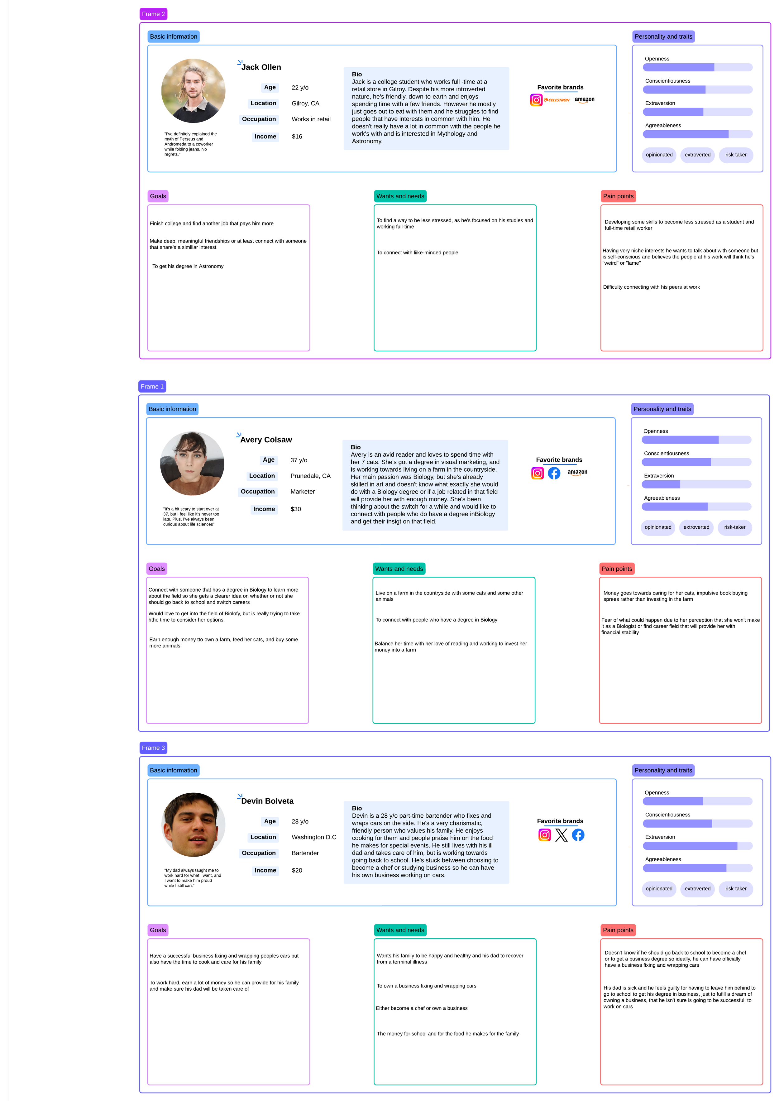
Avery Colsaw
Connect with a person or people who have their degrees in Biology in order to get their insights on what it’s been like for them to get a job related to their degree.
Connect with people that have a job in the field of Biology and get their insight on what’s that’s been like for them and how they are financially.
Have a deeper understanding about the cats she owns, any other animal she may own in the future, and how to care for them.
USER MAP FLOW
Why I Chose “Meditation” and “Journaling” as part of Premium App Features
“To-do List and Goals” Feature for Premium Members: To Keep or Not to Keep?
*Note:
I’m still in the process of creating my wireframes.
Click on the photo to go to the website and get a closer look on the user personas.
Devin Bolveta
Get some insight from people who are Entrepreneurs, car enthusiasts, and chefs.
If he decides to become a mechanic and car wrapper, he can find people on the app interested in getting their car wrapped or fixed up.
He can get some more insight on the forum by explaining his situation and have other people comment some ideas to help him out.
Not only did I want this app to be a place where people shared their passions and interests, I wanted to include a mindful component to it. Studies show that meditation improves our focus by 30% and because of that, it’ll be easier to retain information about whatever someone is learning in the app. I think Journaling would be beneficial too, because the user is writing about their feelings and experiences that will give them insight about themselves, the topic at hand, and their experiences throughout the app.
From the User Interviews and Reviews, people have mentioned feeling overwhelmed with the overabundance of features. I was thinking having these features as Premium features would ease up the use of the app for non-premium members and give the users the choice on having those extra features or not. I’ll also give the non-premium members access to the extra features for maybe a few days to let them decide whether or not they’d want to stick with it. They will not have to give their card information to try out those features for free, unless they decide they want to stick with them.
From my User Research, more user have reported that they would use the “to-do list” and “goals” features over the “meditation” features. Despite the result of that study, I personally think “to-do list" and “goals” are more focused on productivity side of things rather than mindfulness. I would like to include the “to-do list” and “goals” features; but like I mentioned, I’m trying to keep the app as simple as I can with the features it already contains, so it may be have to be left-out (until users begin to request for it).