Mobile Game: The Come Up
Role: Project UX/UI Design Lead for The Come Up
(Work in Progress)
One of the first things I started working on were the buttons on the main screen. I consulted with my boss and other designers and artists on the team on what we should do with the buttons. We originally thought having it look as simple as possible, with very simplistic icons and colors that would seem to go well with the game.
I crafted up some iterations of the buttons with a variety of neutral tones that I thought may fit the overall theme design of the game, but I was later notified that it was too simple and we needed to create something that would catch the users eyes. A designer I was working with also thought maybe adding a backpack icon would be sufficient enough to replace the “shops”, “cars”, and “clothes” buttons, so the layout doesn’t overwhelm the users.
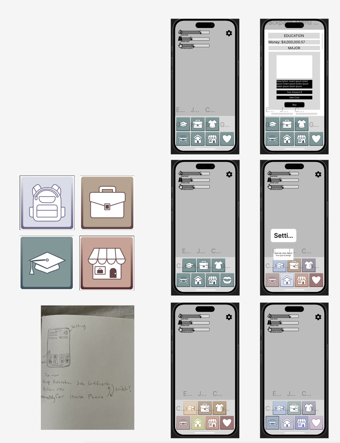

First button iterations in this photo
This is the backpack wireframe we had, which is the button we later scrapped.
One of the first menu screens I got to work on was the setting screen. I created button components where the button changes color once it’s tapped.
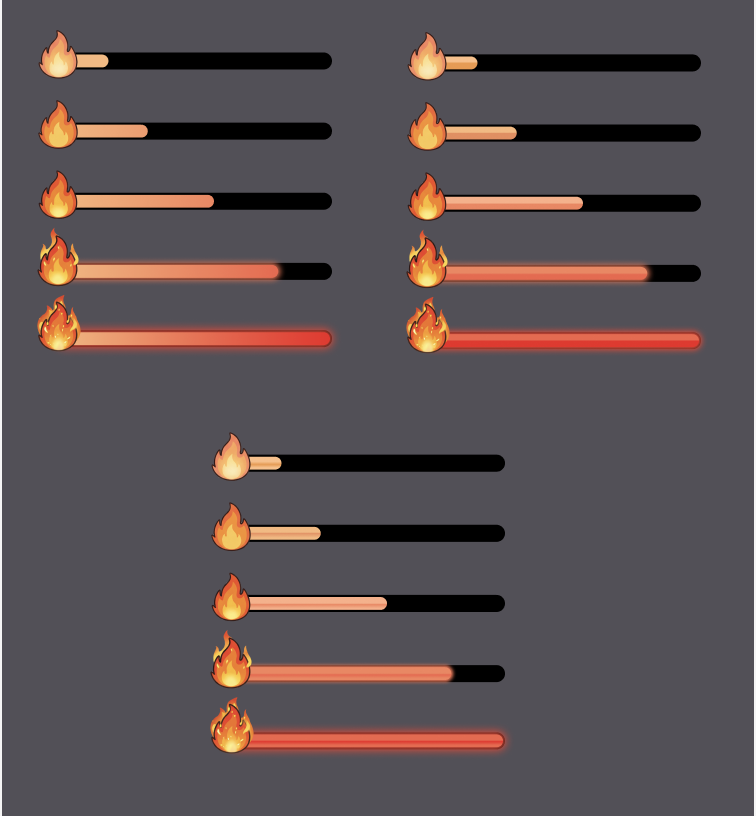
1st few iterations of the heat-bar.
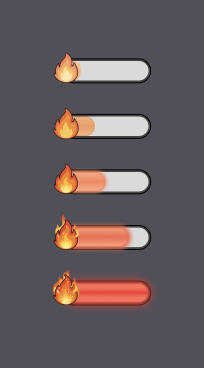
4th iteration of heat-bar. Changed based off feedback and made the sizing resemble the heat-bar on the main screen.
At first, I suggested that maybe we can have the buttons displayed as the menu’s were open (as shown in the video above the heat-bars), but we decided to have the menus cover up the whole screen so that the user will be able to see the entire content.
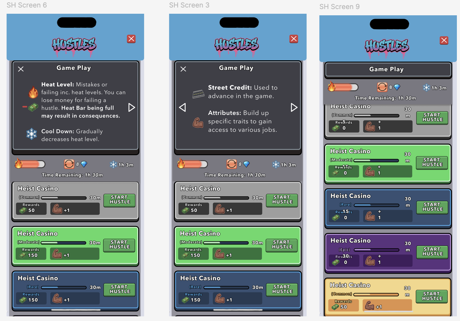
I crafted up a the heat level bar, cool down timer, and refresh menu button on the Street Hustle screen. I thought adding in a few images to the game play, may help the user understand the game play a little better. (All the cards look the same, but they are just placeholders at the moment.)
The user will have to go to the Shop menu in order to buy Diamonds, to be able to refresh their screen more than once. If not, they will have to wait a 12 hour period in order to be able to refresh again.
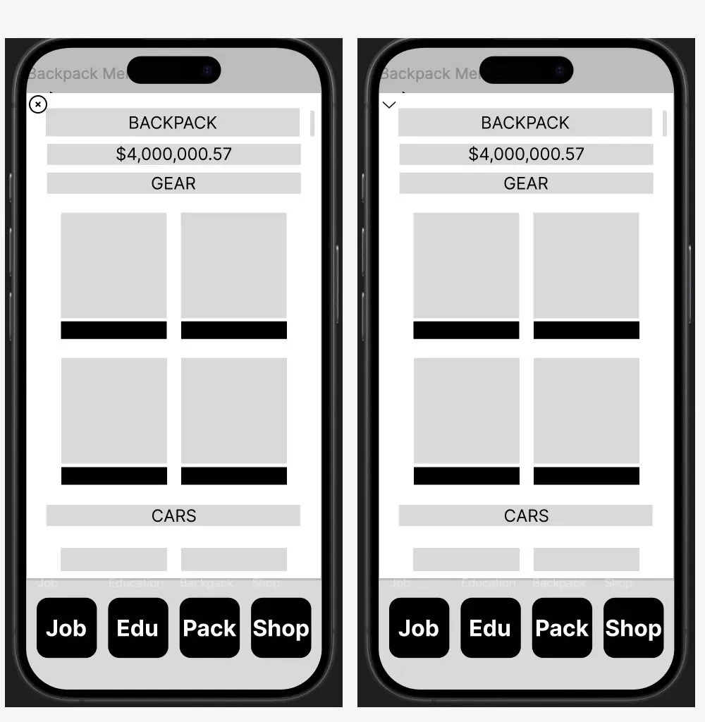
Soon after, I was told the designs were too simplistic and the colors were as little bland, so we needed to create icons that were a little more complex and brighter as well.

I worked on the relationship and hustle button, which included characters to exemplify that these buttons were more personal and based on characters of the game. On the next meeting, I was told that having character’s on the buttons may confuse the users even more and it seemed out of synch with the other buttons that didn’t include any people.
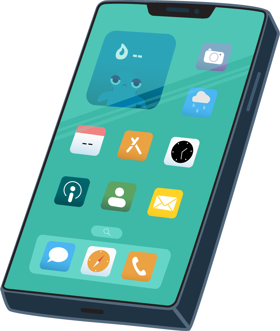
There’s a scene where Té is talking with his dad, so I Illustrated a cell phone, which will be animated to ring when his dad, his mom, or his friend calls.
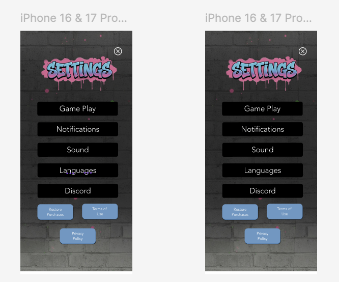
I suggested we make a “graffiti” style for the menu titles that fit with the style of the main title of the game. I was very nervous to share the idea, but they were all on board with it, but we change up the style a bit, which is shown in the image below.

This video shows a bit of my process on creating the hustle menu. It currently has placeholders at the moment. Once I have more details on the hustles, I will adjust the cards accordingly.
It took me a while, but I learned how to clip the cards so it looks like it’s scrolling above the menu at the bottom and disappearing below the tabs at the top. I’m thinking of adjusting the tab with the graffiti drops to match the tab chosen. I may also move the “X” button a little lower.
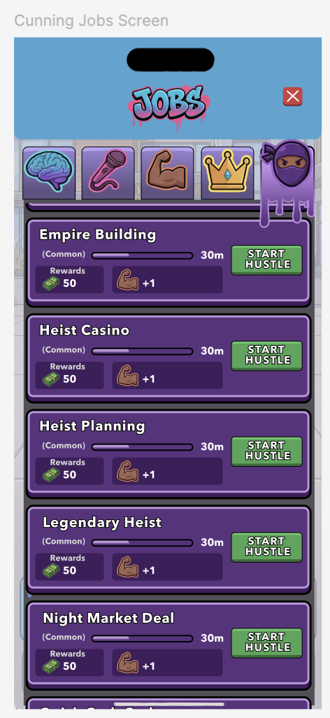
This is my 1st iteration of the jobs screen. The jobs are organized by attributes and highly resembled my 1st Street Hustle screen iteration.
The video above displays the use of the 2nd iteration of the Job menu. We decided to go for a tree diagram style, to guide the player’s eyes to various jobs they can choose from and level up based on the jobs they choose.
The jobs the player decides to accept, affect the attributes the user gains throughout the game. They can choose a lucrative career once they advance through the job levels and raise their specific attributes to a certain level as well.
To be continued…