TeleDental UI/UX Internship
(Work in Progress)

When I remade the homepage, I tried to keep it looking as similar to the original homepage as possible with a few tweaks. I found that the 2nd image they added to the hero section a bit redundant since they already had an image in the background, so that’s something I got rid of. In the 2nd “How it Works”section, they had the numbers located at the bottom of the cards and I was thinking about size hierarchy, so I placed the numbers at the top. I also changed the font type to sans-serif for the paragraph and headings to create a more modern look.

Minimalistic Homepage Iterations 1 - 4

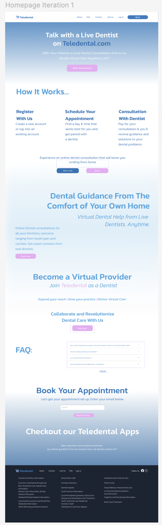
After emailing the remake of the homepage, I was tasked was to create the homepage without any images. I created 4 iterations of a very simple home page with gradients and tried to maintain consistency with the brand colors.
Iterations 1 and 2: I was thinking about the ways our eyes navigate through the page and I wanted to visually separate the sections with the gradient. I changed the color of the texts with each iteration for visual distinction.
Iteration 3: I kept the layout but thought it might be difficult to read the text that was in the gradient, so I changed the center to just a white background.
What I would have changed: The F.A.Q title and questions in the 1st and 2nd iteration were too far apart and I think I would have kept the center alignment for the “Become a Virtual Provider section and kept the normal font-type “Collaborate and Revolutionize Dental Care With Us” rather than keep it bold. I would have probably increased the spacing between the sections to increase negative space and make it easier for the user to view it.

I was still learning how to create various components during this time and I would have had the arrow pointing up once the menu is dropped down and have spacing between the section underneath the answers.
I attempted to keep the look consistent with the iterations of the minimalistic home page.
What I would have changed: Basically the same thing that I mentioned on the first edits I made. I would also adjust the top of the left side of the text in the “Dentist Sign Up” page to be aligned with the title of the “Dentist Sign-Up” heading on the right.
Footers

From the feedback I was given, I was told it was difficult the read the section in the middle of the page because of the gradient in the center and they thought the layout of the text was too randomized. I made a 4th iteration where the majority of the text is center aligned and I included some cards in the “How it Works” section and tried to keep it very simple with a blue shadow that has 15% transparency and some blur. I added corners to the buttons to make it create a more modern look. The text in the footer also has more spacing.
Iteration 4-2: Added more spacing between the sections and it displays the result of when you open a question from the dropdown menu.


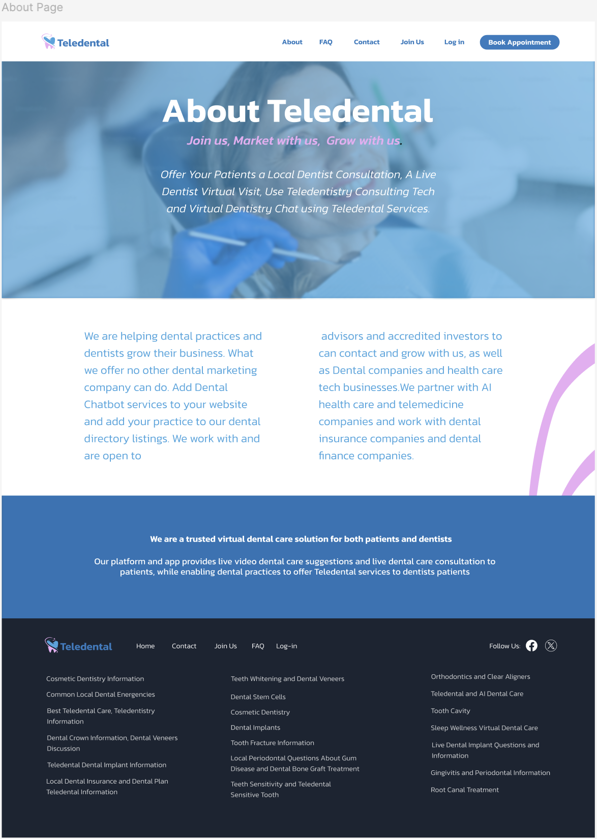
Sign-Up Page

There was this pink graphic on the homepage behind an image of a person on the original homepage and I wanted to include that throughout the other pages.
What I would have changed: I would reduce the amount of text, but I was informed that it’s to improve the S.E.O. I’d also add text above the form boxes informing the user what would need to be added in the text boxes. I would have added a search box in the F.A.Q page.
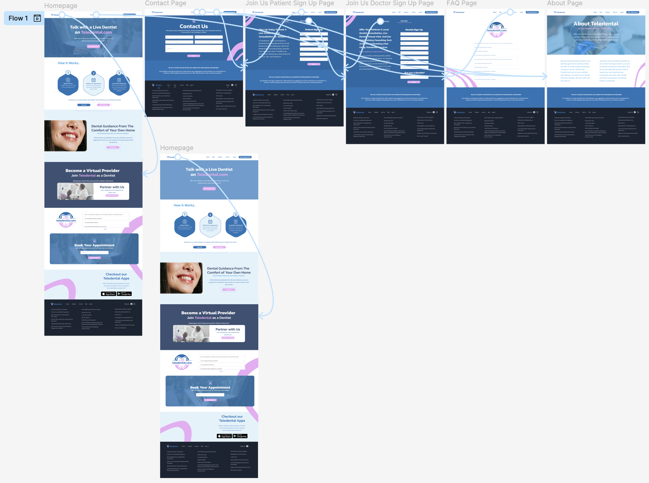
Homepage Flow

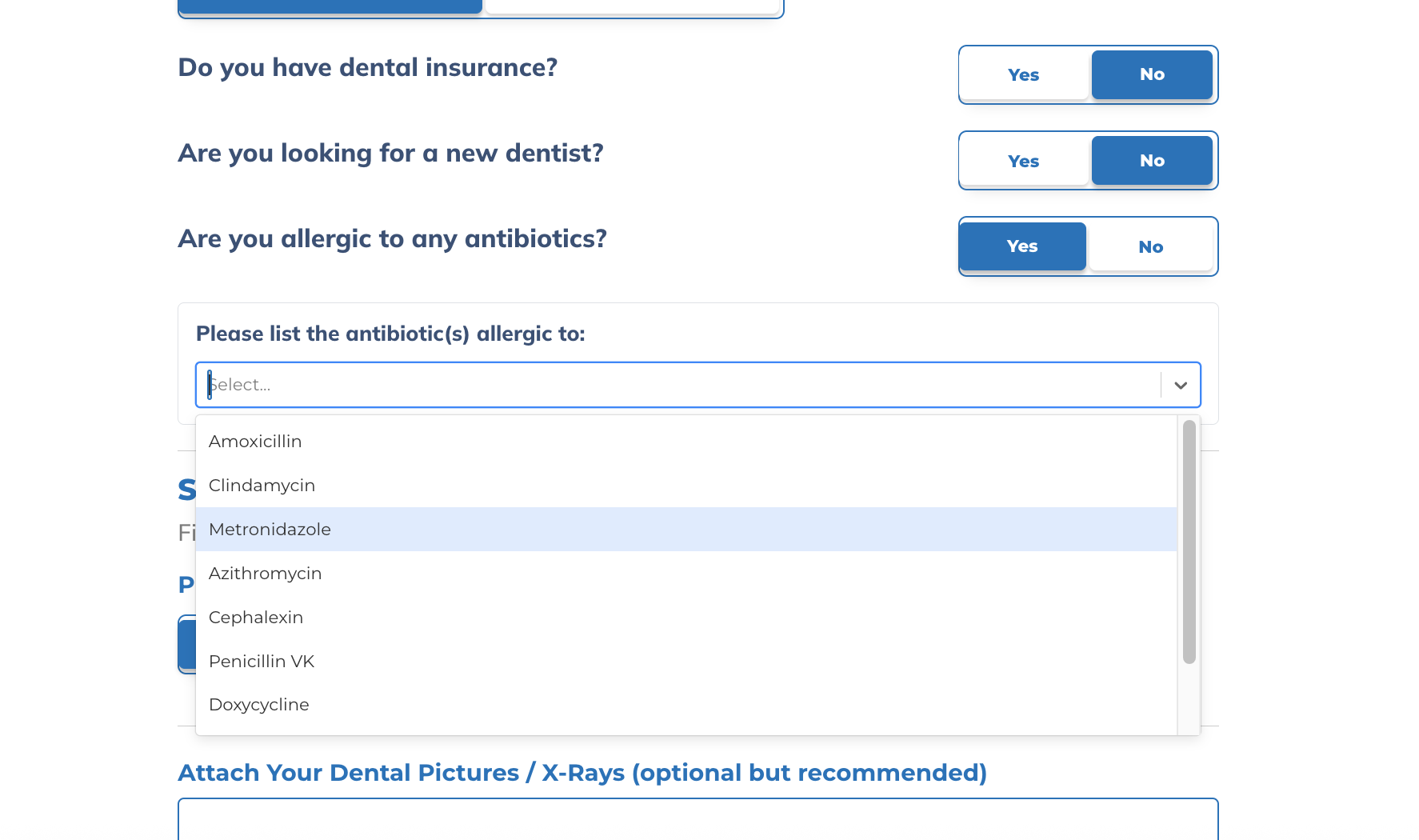
Dropdown Menu Component opened
F.AQ. Dropdown menu opened


Footer Components


Office Listing & Directory Sign-Up Wireframes
Mobile Versions of the Site


Booking & Listing Page Flow